I decided to keep the sampler quilt small. I could make it grow by adding the small letters, the numbers, a saying, my whole name, some pieced house blocks. It's very easy to keep going, but I'm not going to. Instead I'll demonstrate how to put it together.
The first step is to decide on a layout. In this first couple of pics I was checking on a border. Do I want to keep this quilt strictly red and white or add a different color in? Tried this with blue too, but the photo didn't work out. I've made enough 4th of July quilts lately anyway.

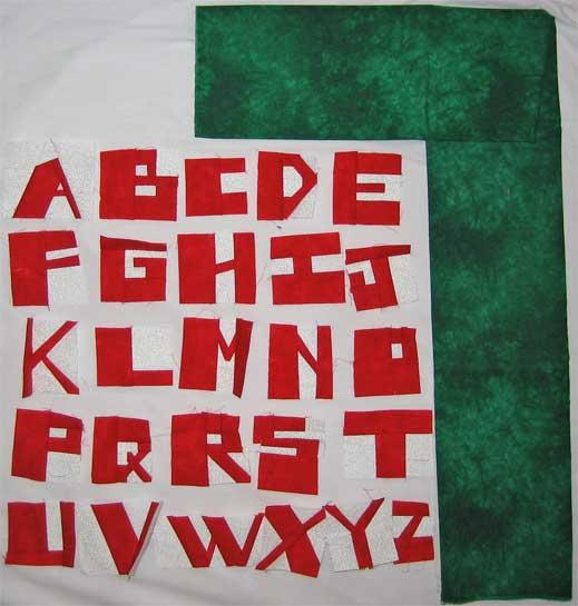 After playing with borders and layout, I made all the letters 2 7/8" high. Some got cut down and others had background fabric added to their top, bottom or both and then got cut down. You do not have to work this precisely. You could get them all vaguely to the height you want and after you join them together lop off any extra.
The letters are obviously going to have a hard time fitting on that bottom row if I include six of them, esp when the W is so wide, so how about if I slip the Z down onto the bottom row? Oh, and I decided to make my initials and the last two digits of the year as well. Now it's really crowded on the bottom row again, but I could prune down the b, r, and zero.
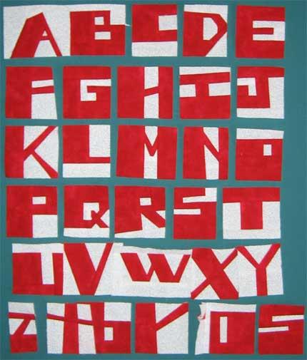 Here's another option, to have X Y Z on the bottom row. I could also jam those over to the left and start making numbers until I hit the end of the line. You'll notice in this example I've now got six letters per row instead of the five above.
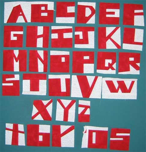
2 comments:
The difference between the trimmed letters and the untrimmed letters is amazing. They look really great..and I love the smallness of some..makes ya wonder..LOL..like the skinny K..I'm thinking..."hmmm..did she just pick those red pieces up from the floor?". It's wonderful what it does to my head. Can't wait to see what you decide next.
Looking at this again...you know what is really fun to me is to look at the T and the U....they are exactly the same, only opposite colors! fun optical illusions. I like what Finn said about wondering about the other letters too..I like some skinny, some fat, some short, some tall..just because!
Bonnie
Post a Comment