Another couple of border options. Here's a purply pink inner border used with that pinky red big border. And yes, it would be a full inner border, I just don't have enough of the fabric to cut it up until I'm sure.
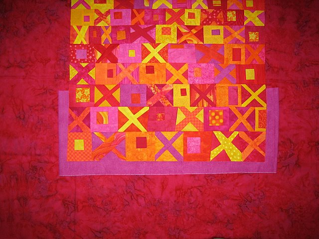 I knew Dawn was going to cry at the thought of losing this really cool 3-colored batik border fabric. Hey, I love it too. What about in a smaller propertion? Here's what I did above only know the pinky red wouldn't be really wide (maybe 2 1/2 or 3 inches?) and THEN the funky cool border.
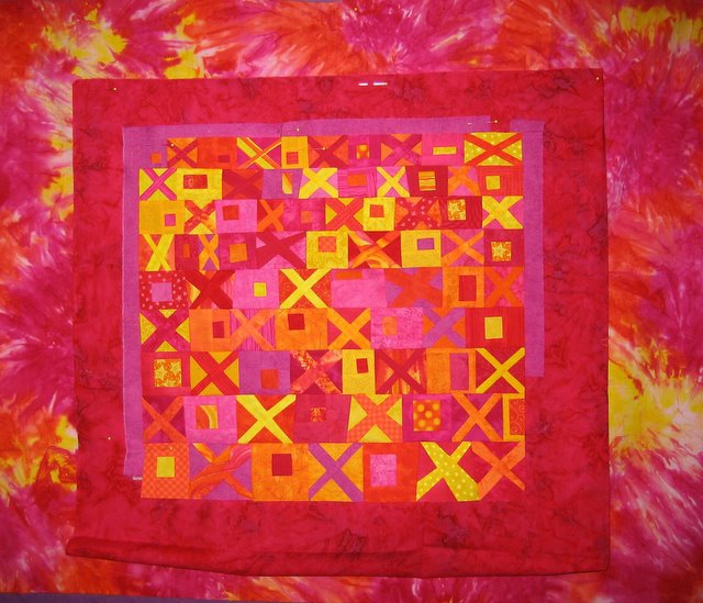 Think it looks much better this way, but is it the best? Still looks wild and there isn't as much focus on the Xs and Os as I think there should be. But it's fun. Aaaaghhh. Not making any decisions soon.
But as I preview this post, I'm liking the top version better than the wild one.
Geeze Louise, Pokey is getting whiney and begging for attention - she's gonna show me and start chewing up paper. Right now she's on an old envelope but when she hits the bank statement there'll be trouble.
12 comments:
Tonya -
I am loving that wild border, I think the Xs and Os framed with a border of the red and then the wild border looks great! My eye still goes to the letters first!
Laura
Well I love the one with the wild border! But yes, you need those 2 inner borders to break it up - that really helped. I love the purply/pink most inner border with the X's and O's.
I think either of these work - but you know, I keep wanting you to put that wild fabric on the outside! But then I guess it doesn't come to me! :)
I do like the top one better. I still like the 'pin up cloth' purple! But if I didn't have the option, I'd choose this one...defninately. Skinny purple, wide red...and use the wild fabric on the back or something? And binding?
Bonnie
I like the top one best too. But .. what if you inserted a very narrow yellow border in the middle of the wide pinky red border?
No matter which route you take, this is one cool quilt.
Judy L.
I love the bright multi-coloured batik... I'd be tempted to use it for an interior border then go to the more solid, cause you're right the X and O are a less central focus with it as a wide outside border...
It'll be bright and cheerful whatever you go with :-)
I vote for the wild border too, but either way it is going to look great!
I realy like this, my only comment is you can never go wrong with black. I would put a narrow black border around the x/o's before the purple then the red then finish with the tie dyed wild cloth. Oh well I like black in quilts so that is my two cents. I enjoy looking at your creativity.
Probably just my eyes, but when I look at the top version, it looks like the letters are "rising up" out of the deeper color.
With the lower version, to me, it seems they are "floating down" into the wild batik. Like I said yesterday, big help I am!
P.S. For the record, as a fully certified Libra, I don't give advice..*VBG* Always on the fence...*G*
I'm new to this caper but I agree with Dot about the black. Try it with a narrow black or navy border (something with no red in it) and see if that then works with your beautiful multi fabric. It should give the letters the little extra space they need to stand on their own but also pick up all the beautiful colours in the border fabric. I look forward to seeing what your decide!
I'd have a hard time deciding because I like both options. I like that wild border fabric alot :)
I like both versions as well favoring the wild border most. Like Dot and Duyvken said, might want to try it with a narrow black border. I think that would enhance the hugs n kisses and take the focus away from which ever border fabric you use. Gona be a great quilt.
The tri-color works really well with the x's and o's (love those, by the way), but I can't get over the jolt. The monochrome is much less jarring and still striking, I think. Pretty, pretty.
Post a Comment