Sunday, May 28, 2006

El Alamein

The trip to Alexandria was nice. Not spectacular, but relaxing. It was my first time seeing the Mediterranean Sea (flying overhead doesn't count). There in Alex it wasn't so nice, but further west along the coast the water was spectacular shades of lapis lazuli blue and turquoise and everything in between.

My favorite part of the trip was the Roman Catacombs, which we weren't allowed to photograph. The catacombs had originally been dug out for one spectacularly wealthy family and later enlarged to hold more bodies and ashes. It was a huge space underground, large enough to hold horse races and champion horses' burials (after their natural deaths).

Throughout Alexandria there is a blend of Greek, Roman, and Egyptian themes. There's the jackal-headed god Anubis looking wolf-like. And Isis dressed up in a toga-like dress with long curls - that's just wrong. I did like the Medusas tho.

On Saturday we went down the coast to El Alamein, the site of a WWII battlefield. Have to say the museum was horribly out of date and hard to understand - someone translated the signs directly from Arabic so it read terribly. And the transliterations: Mosaleni instead of Mussolini.

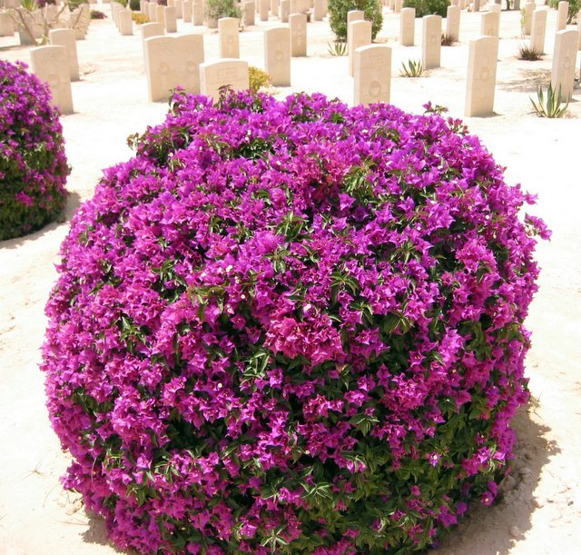
I was pleased to see that the Commonwealth Memorial and gravesites are very well maintained. Far too many men are buried here and should never be forgotten. It was serene and starkly beautiful.


Thursday, May 25, 2006

Kitty Condo

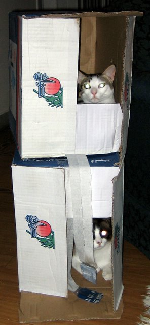
The kitties do so love their boxes.

Sorry ya'all. I meant to be much better about getting the tutorial in here for you. I appreciate all the feedback you've given me.

I've had some distractions this week and have been off my sewing game. I had a beading class yesterday as well as quilting bee. Plus I've been making arrangements for our trip to Alexandria, which is on the northern coast of Egypt on the Mediterranean Sea. Even tho I knew what the dates were for the trip I still thought it was next weekend. Surprise it's THIS weekend - we leave in the morning at 6:45 and come back Saturday at 11:00pm.

A quick answer to Shellie's question: yes, my lower-case letters really are wide. I love how it looks. Take a peek at Bad to the Bone and read the post if you haven't before. That's one of my favorite quilts I've ever made and one of the things I love about it is the short, wide letters.

It all comes down to personal preference and how you like the letters to look. That's why a project where you make the same letters over and over again (Such as Xs and Os or L-O-V-E or anything else you might want to do) can be so valuable. You play around and figure out your favorite way to make the letters.

Plus you get practise. The more practise you get, the more you will like how your letters turn out. I know I say that over and over for things like the freehand fan quilting, but it's true. Practise. I've been doing these letters for over five years now so don't compare your letters with mine (that means you, friend Nina).

Practising doesn't mean you're working towards perfection (never a goal I endorse). It just means finding your confidence and your own way of doing it (whether sewing or quilting) that suits you and works for you.

Something I've learned over the years: a stick figure drawn with authority looks pretty darn good.

So I may not be back for a few days. Hubby has Sunday off for Memorial Day (working week here is Sunday through Thursday) so I'm not sure I'll even get computer time when we get back into town. Not knowing what week it is (and when our weekend getaway was coming up) really through me off this week.... I'll catch up with ya'all soon.

Tuesday, May 23, 2006

See, I'm still quilting

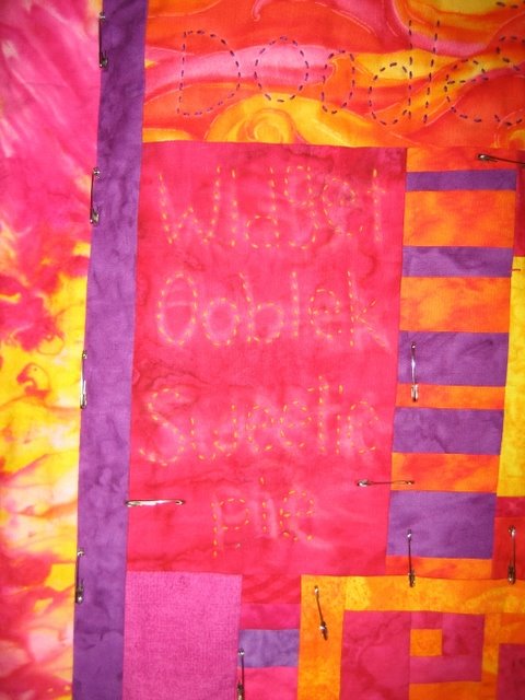
I've quilted some more terms of endearment on the quilt of the same name. I wasn't initially sure I was going to quilt terms in this reddy-pink with purple fabric on the other side of Abominables, but I've been having so much fun with this part of the quilting I decided to go for it.

I used the same floss color as on the other side and no, it doesn't show up well, but that's okay. Sometimes I want things to pop out and sometimes to only be noticeable upon closer inspection. You can see my chalk marks still, but not to worry. As the quilt continues to get handled they'll rub off and will definitely disappear in the wash.

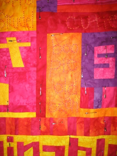
And here's another area. I quilted in the big long bit of red. Once again, that wasn't in my game plan, but I wanted "cutie patootie" somewhere and it fit here. Can you see the chalk marks of my initial lettering? I wrote the whole phrase out and discovered that I had loads more space on the right hand side, so I rubbed chalk off and rewrote it, this time moving the letters to the right some.


I don't put many pins in during the initial baste, or at least not as many as I need. I don't have enough safety pins. As soon as I get ready to quilt in an area, I put loads more pins in. You can still see them clustered around the bottom of the block I was working on. I'll take those extras out and move them to the next spot I'm quilting.

Nothing new or exciting of note here. I get to dump out and replace all the kitty litter today - oh joy. My nose tells me it needs to be done, so no more procrastinating.

Monday, May 22, 2006

Revised Lower-Case Tutorial Begins

I got some great feedback yesterday and I'm hoping that maybe this addresses some of the problems. Is this better, worse, or no different from yesterday's edition? Still confusing or better? [Note: I did make a couple of changes to yesterday's edition as well.]

The big difference between this version and yesterday's is that I've put the final letters at the top of the section so you can see what I'm trying to build.

Lower-case letters are generally less complicated than the capitals (you can go to Quiltville here for instructions) . Quite a few are made the exact same way, tho you may wish to make them a bit smaller.

I use the same size strips for these as I do the capitals and that's all in the Quiltville tutorial as well. I know my letters come out pretty small, but I just like them that way.

While you are making the letters, remember your 1/4" seam allowance. The goal isn't to get a great looking letter all on its own - it's going to be sewn into a bigger picture. You may need to add a wider strip of letter fabric (when called for) at the top, bottom, or sides.

For ease in writing I'm going on the assumption you're going to try every letter (which you certainly don't have to). I'm starting out with the easiest.

Before we get started, can I just say the most important part of this process is to think about what you're making. You know how to make letters - you probably write something every day. You can do this. Easy peasy lemon squeezie. Oh, and there are many different ways to make some of these letters so don't think they have to be done this way.

We always begin sewing the letters with the smallest part of the letter, moving to the bigger parts. You'll see what I mean.

The letters c, o, p, s, u, v, x, and z are constructed the same as the capitals. I figure you can make an l. Little k is the same as the capital K, but I make the leggy bit a bit smaller and sew background fabric across the top before adding the left-side letter fabric.

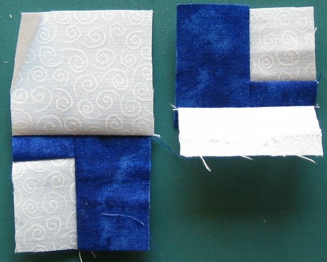
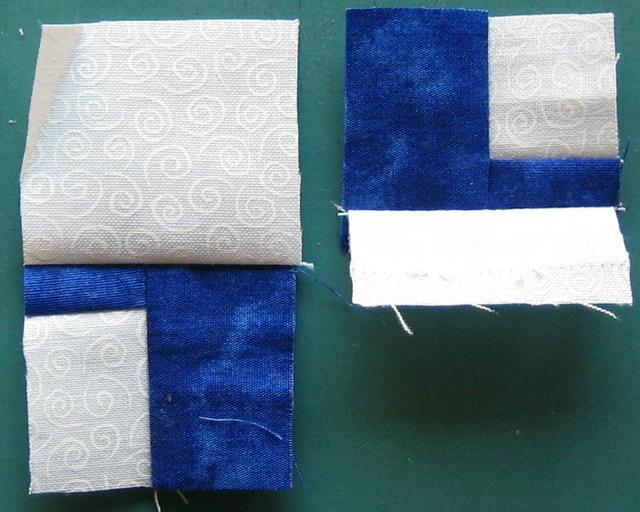
Here's i and j.


You can figure out little i. You'll essentially need two of them (if you're making all the letters) because one is going to morph into a baby j.

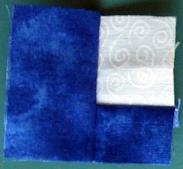
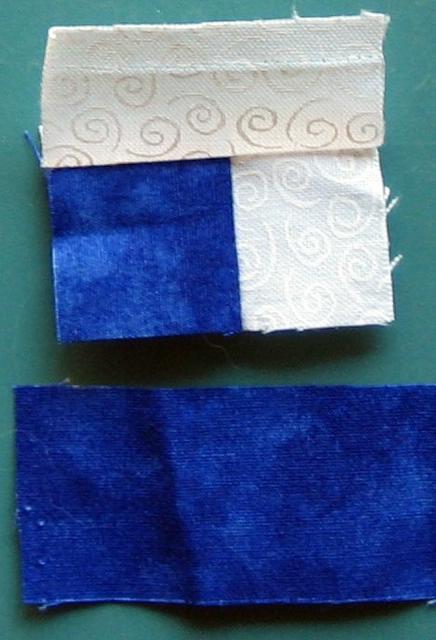
I make my little j with a bit of character by adding that bit that swoops up on the left side. I do that by starting with a small square of letter fabric surrounded on two sides by background fabric. (I should have used a wider bit of background fabric on the top.) You can also just use a large square or rectangle of background instead. Sew that to some letter fabric and trim even.

Then you're ready to attach it to an i.
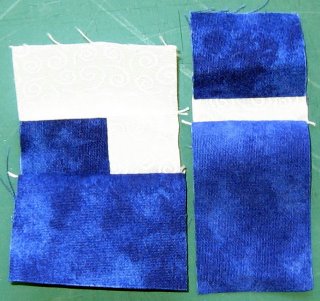
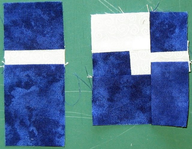
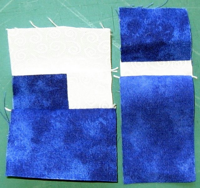
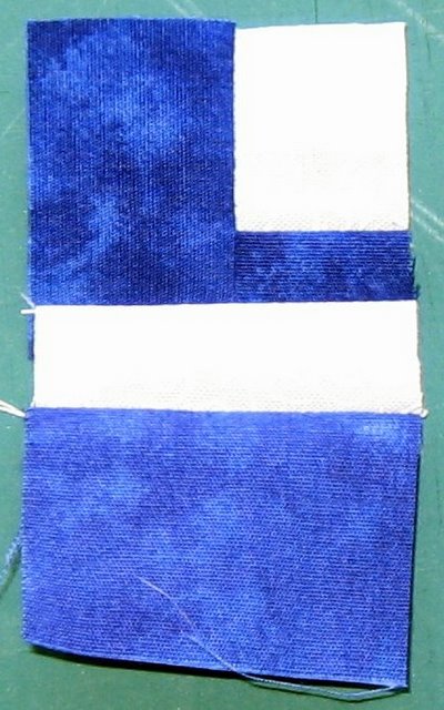
Here are the completed h and y.

You can make a little y the same as the capital Y, but I now like this other version better. You could also just make another h and add a strip across the top (aka bottom) of it to get a y, but I like to avoid seams on the sides of the letters whenever possible.

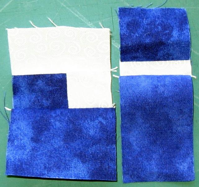
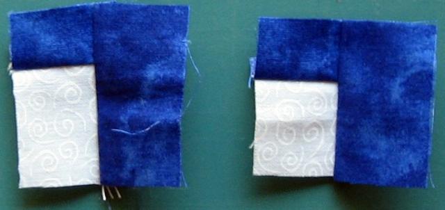
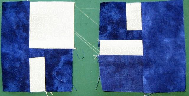
Both the little h and y begin the same with the "bump out" - a bit of background surrounded on two sides by letter fabric. The h background is rectangular.

The y small and square.
The h gets a wide bit of background fabric on the top, the y gets a narrower bit on the bottom.

And then the y needs the lower bit of the letter.
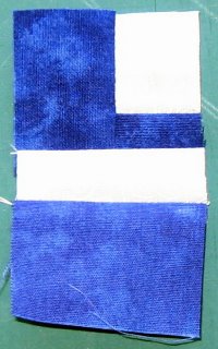

And both get a wider strip of letter fabric to finish them off. Voila.

Sunday, May 21, 2006

Lower-Case Letters Begin

*** Revised 22 May ***

Lower-case letters are generally less complicated than the capitals (you can go to Quiltville here for instructions) . Quite a few are made the exact same way, tho you may wish to make them a bit smaller.

I use the same size strips for these as I do the capitals and that's all in the Quiltville tutorial as well. I know my letters come out pretty small, but I just like them that way.

While you are making the letters, remember your 1/4" seam allowance. The goal isn't to get a great looking letter all on its own - it's going to be sewn into a bigger picture. You may need to add a wider strip of letter fabric (when called for) at the top, bottom, or sides.

For ease in writing I'm going on the assumption you're going to try every letter (which you certainly don't have to). I'm starting out with the easiest.

Before we get started, can I just say the most important part of this process is to think about what you're making. You know how to make letters - you probably write something every day. You can do this. Easy peasy lemon squeezie. Oh, and there are many different ways to make some of these letters so don't think they have to be done this way.

We always begin sewing the letters with the smallest part of the letter, moving to the bigger parts. You'll see what I mean.

The letters c, o, p, s, u, v, x, and z are constructed the same as the capitals. I figure you can make an l. Little k is the same as the capital K, but I make the leggy bit a bit smaller and sew background fabric across the top before adding the left-side letter fabric.

You can figure out little i. You'll essentially need two of them (if you're making all the letters) because one is going to morph into a baby j.

I make my little j with a bit of character by starting with a small square of letter fabric surrounded on two sides by background fabric. You could just use a larger square of background instead. Sew that to some letter fabric and trim even.

Then you're ready to attach it to an i.

An i and j.
You can make a little y the same as the capital Y, but I now like this other version better. It starts out the same as a little h. Both begin with a bit of background surrounded on two sides by letter fabric. (The beginning of the y is upside down in this picture).

The h gets a wide bit of background fabric on the top, the y gets a narrower bit. I hope I didn't make this confusing by flipping the y in the proper direction...

And then the y needs the lower bit of the letter.

And both get a wider strip of letter fabric to finish them off. Voila, an h and y.

Let me know if any of this needs clarification or changes. Sometimes I read this stuff over too many times and it all gets jumbly in my brain.