Lower-case letters are generally less complicated than the capitals (you can go to Quiltville here for instructions) . Quite a few are made the exact same way, tho you may wish to make them a bit smaller.
I use the same size strips for these as I do the capitals and that's all in the Quiltville tutorial as well. I know my letters come out pretty small, but I just like them that way.
While you are making the letters, remember your 1/4" seam allowance. The goal isn't to get a great looking letter all on its own - it's going to be sewn into a bigger picture. You may need to add a wider strip of letter fabric (when called for) at the top, bottom, or sides.
For ease in writing I'm going on the assumption you're going to try every letter (which you certainly don't have to). I'm starting out with the easiest.
Before we get started, can I just say the most important part of this process is to think about what you're making. You know how to make letters - you probably write something every day. You can do this. Easy peasy lemon squeezie. Oh, and there are many different ways to make some of these letters so don't think they have to be done this way.
We always begin sewing the letters with the smallest part of the letter, moving to the bigger parts. You'll see what I mean.
The letters c, o, p, s, u, v, x, and z are constructed the same as the capitals. I figure you can make an l. Little k is the same as the capital K, but I make the leggy bit a bit smaller and sew background fabric across the top before adding the left-side letter fabric.
You can figure out little i. You'll essentially need two of them (if you're making all the letters) because one is going to morph into a baby j.
I make my little j with a bit of character by starting with a small square of letter fabric surrounded on two sides by background fabric. You could just use a larger square of background instead. Sew that to some letter fabric and trim even.
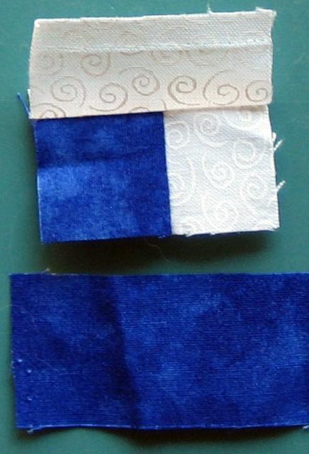 Then you're ready to attach it to an i.
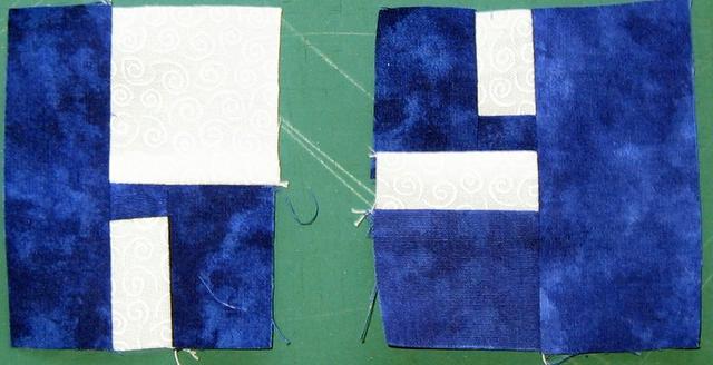
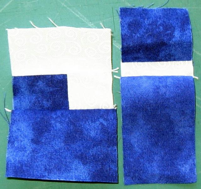 An i and j.
 You can make a little y the same as the capital Y, but I now like this other version better. It starts out the same as a little h. Both begin with a bit of background surrounded on two sides by letter fabric. (The beginning of the y is upside down in this picture).
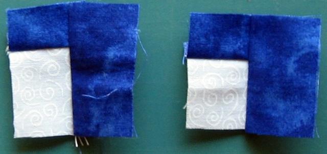 The h gets a wide bit of background fabric on the top, the y gets a narrower bit. I hope I didn't make this confusing by flipping the y in the proper direction...
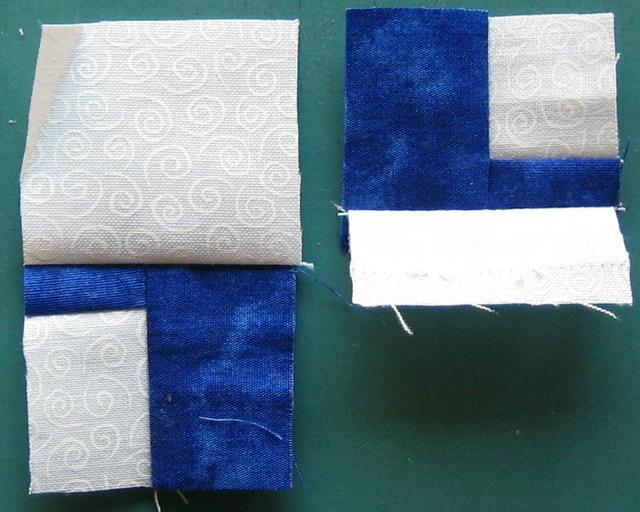 And then the y needs the lower bit of the letter.
 And both get a wider strip of letter fabric to finish them off. Voila, an h and y.
5 comments:
I like the way you did your Y. I had trouble with mine and was not satisfied with the result. I may change it. I also like the way you put the cross bar on the F in your Mother's Day quilt. I gave the Home is Where the HEart IS wall hanging to my son and family and they loved it. People really like writing on their quilts. Thanks again for the tutorial. It opened up a whole new worlld for me.
Hi Tonya, the letters look great. Thanks again for sharing yet again! I can't wait til I can begin using them in a project. 2 of my ufo's will be marked off this week, sooo.....hehe.
I got the tutorials just fine..but it did take me a few seconds to figure out where you were starting on the letter. Does that make sense?
With the i and j it took me a few seconds to realize that we were starting with the curved section of the "j" first, once I did, I got the "Ahaaa... Now I see!" moment.
So when you went to the h and y, I looked for a sec and then knew we were starting again with the hump or curved section of the letters and not thier "stems" if you will. Does that make any sense?
Now I tend to run off at the mouth, but I would add a line in the beginning to say where you're starting when making each letter. OR...I would imagine that most of the letters start with the appendages before adding the stems, right? So you could say that in the beginning of the whole tutorial, in general, and then only mention something IF a letter doesn't start that way.
Other than that, it's just great because I probably would have messed a few up before thinking it was better to start with the curvy parts. I would have done the stems a few times before I realized I was working backwards. Hope this helps!
The one thing I did different from your tutorials, when starting the letters for Liberty and Justice, was pre-sewing some strips. At the beginning, I sewed a skinny red to a thick blue, then a thick red to a skinny blue. That way, I had pre-sewn sections that I could just whack off a hunk when needed.
I also sewed a skinny-to-thick red strip to a thick-to-skinny blue (ending up with a roughly rectangular strip) for when I wanted to add some wonkiness.
The only other word of advice I might have needed was a reminder that when you attach the letters TO something, you're going to lose ¼ inch on the top and bottom in seam allowances, I should have made some of the horizontals thicker.
Okay my head hurts now! I think I'll stick with capitals for my first attempt LOL :)
Post a Comment