Lower-case letters are generally less complicated than the capitals (you can go to Quiltville here for instructions) . Quite a few are made the exact same way, tho you may wish to make them a bit smaller.
I use the same size strips for these as I do the capitals and that's all in the Quiltville tutorial as well. I know my letters come out pretty small, but I just like them that way.
While you are making the letters, remember your 1/4" seam allowance. The goal isn't to get a great looking letter all on its own - it's going to be sewn into a bigger picture. You may need to add a wider strip of letter fabric (when called for) at the top, bottom, or sides.
For ease in writing I'm going on the assumption you're going to try every letter (which you certainly don't have to). I'm starting out with the easiest.
Before we get started, can I just say the most important part of this process is to think about what you're making. You know how to make letters - you probably write something every day. You can do this. Easy peasy lemon squeezie. Oh, and there are many different ways to make some of these letters so don't think they have to be done this way.
We always begin sewing the letters with the smallest part of the letter, moving to the bigger parts. You'll see what I mean.
The letters c, o, p, s, u, v, x, and z are constructed the same as the capitals. I figure you can make an l. Little k is the same as the capital K, but I make the leggy bit a bit smaller and sew background fabric across the top before adding the left-side letter fabric.
You can figure out little i. You'll essentially need two of them (if you're making all the letters) because one is going to morph into a baby j.
I make my little j with a bit of character by starting with a small square of letter fabric surrounded on two sides by background fabric. You could just use a larger square of background instead. Sew that to some letter fabric and trim even.
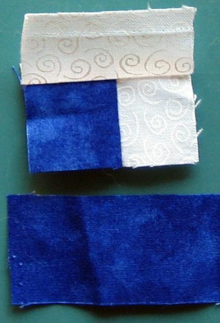 Then you're ready to attach it to an i.
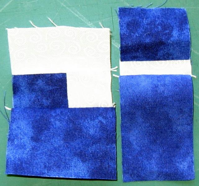 An i and j.
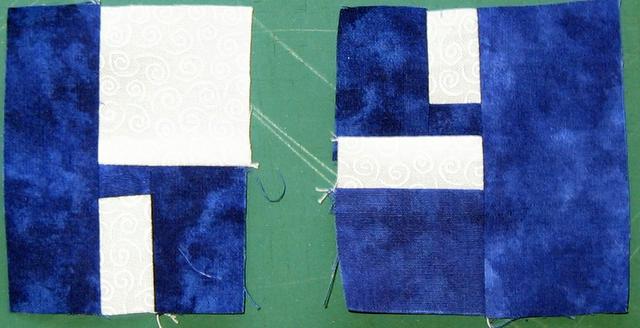
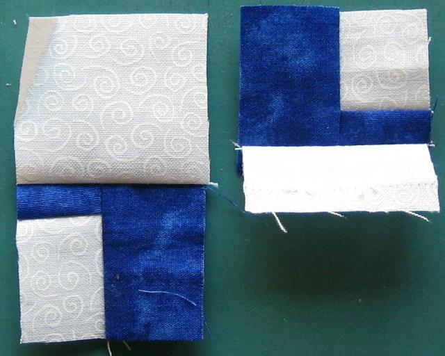
 You can make a little y the same as the capital Y, but I now like this other version better. It starts out the same as a little h. Both begin with a bit of background surrounded on two sides by letter fabric. (The beginning of the y is upside down in this picture).
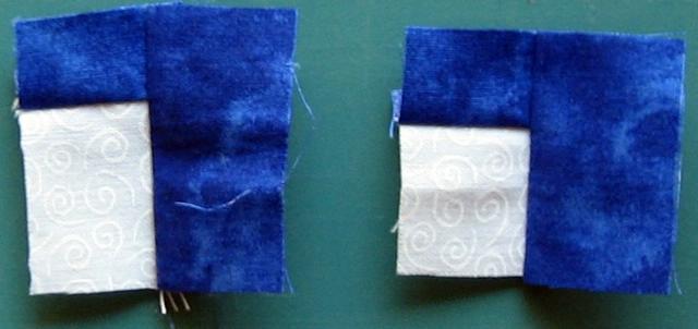 The h gets a wide bit of background fabric on the top, the y gets a narrower bit. I hope I didn't make this confusing by flipping the y in the proper direction...
 And then the y needs the lower bit of the letter.
 And both get a wider strip of letter fabric to finish them off. Voila, an h and y.